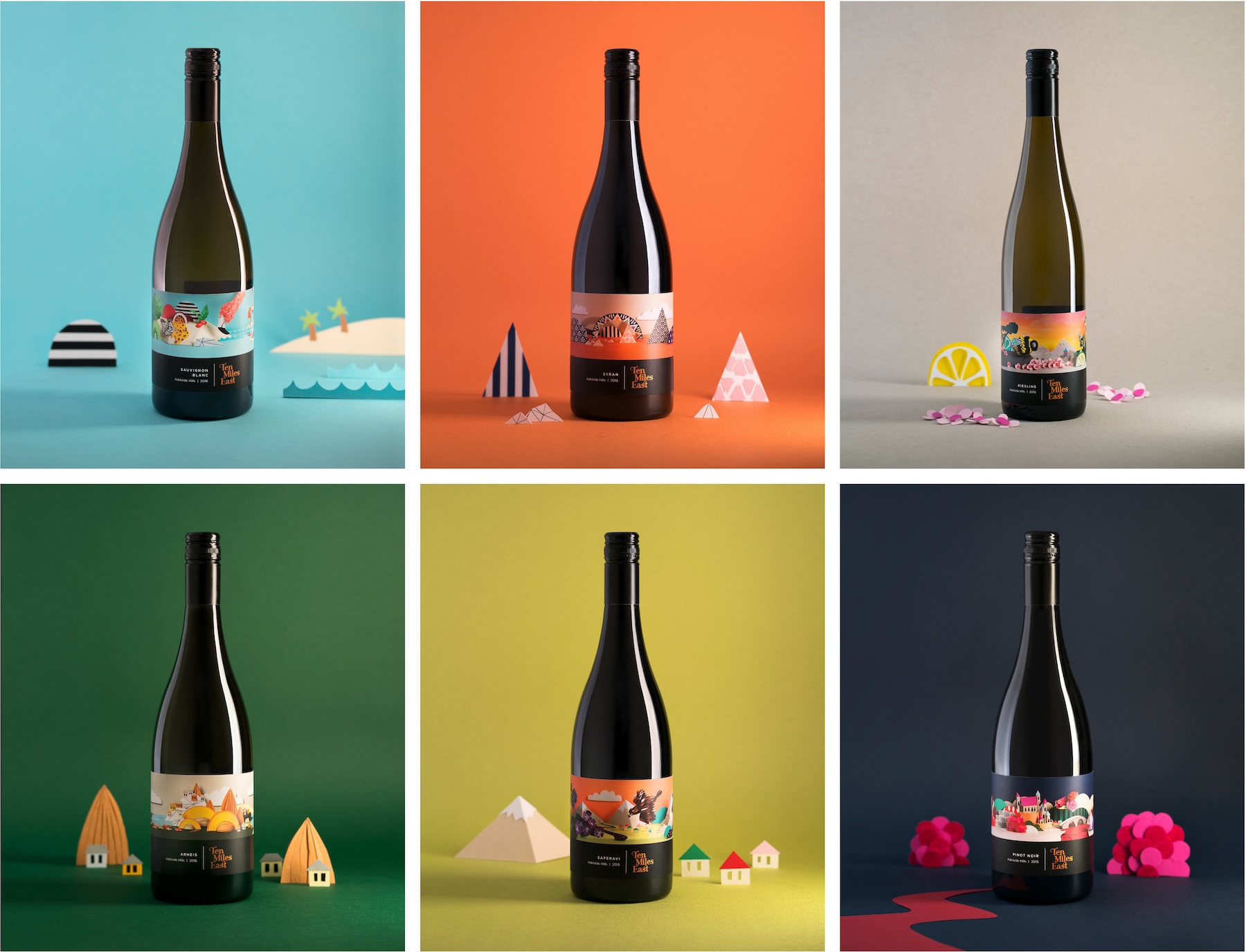
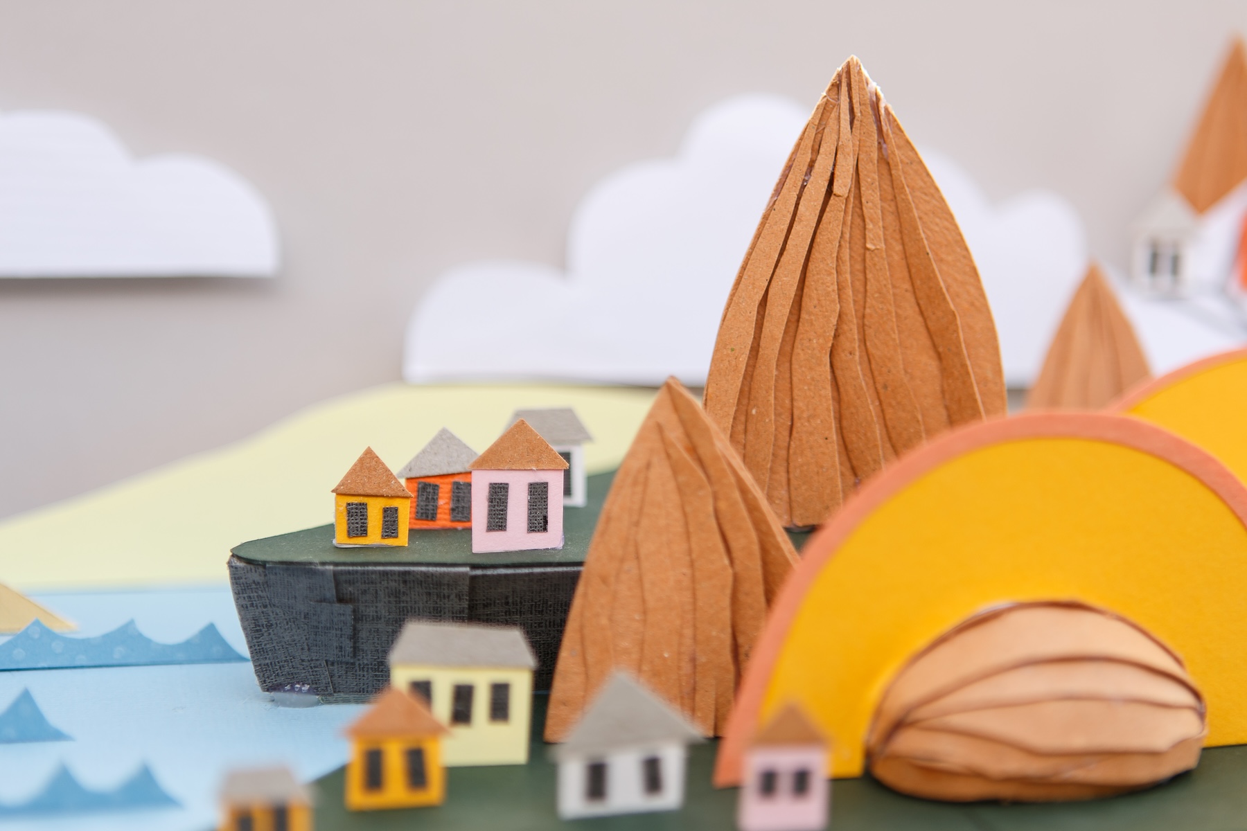
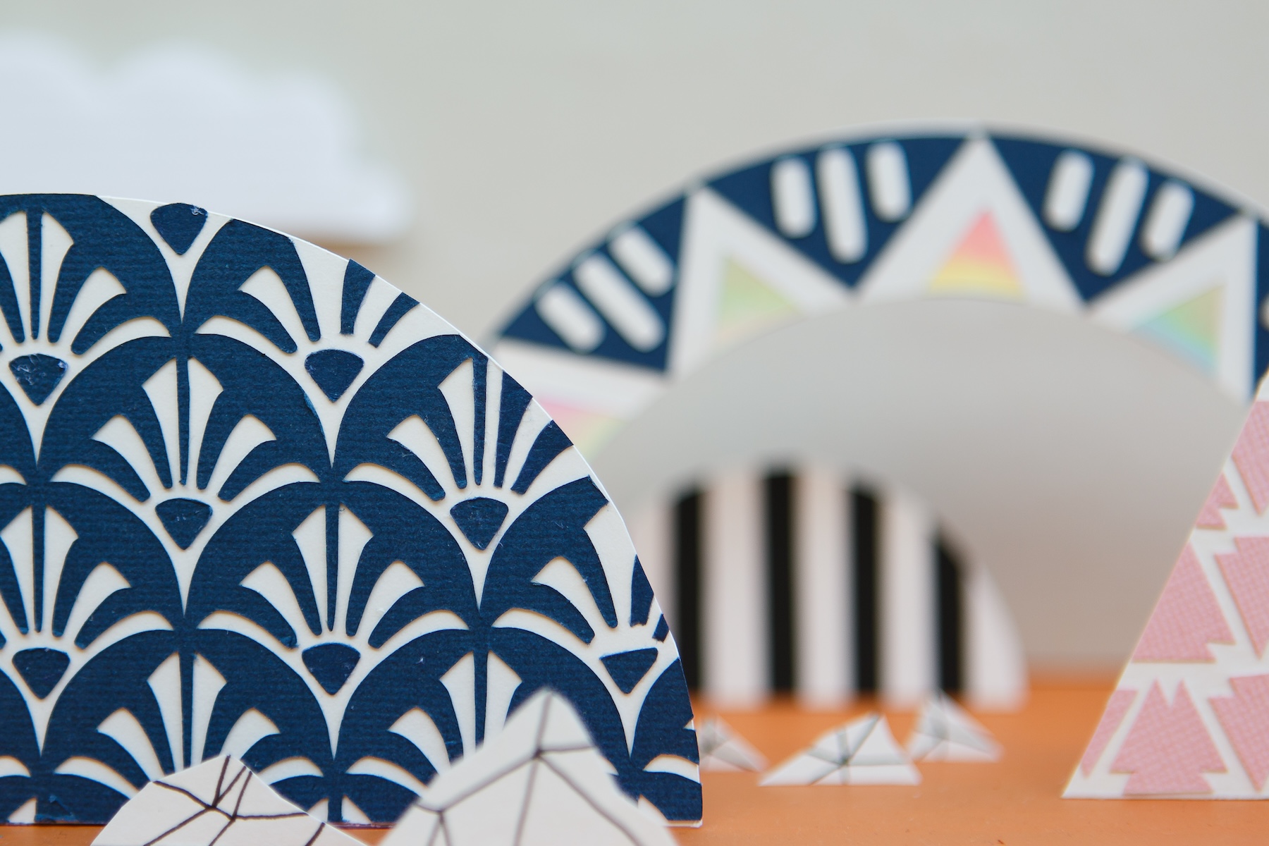
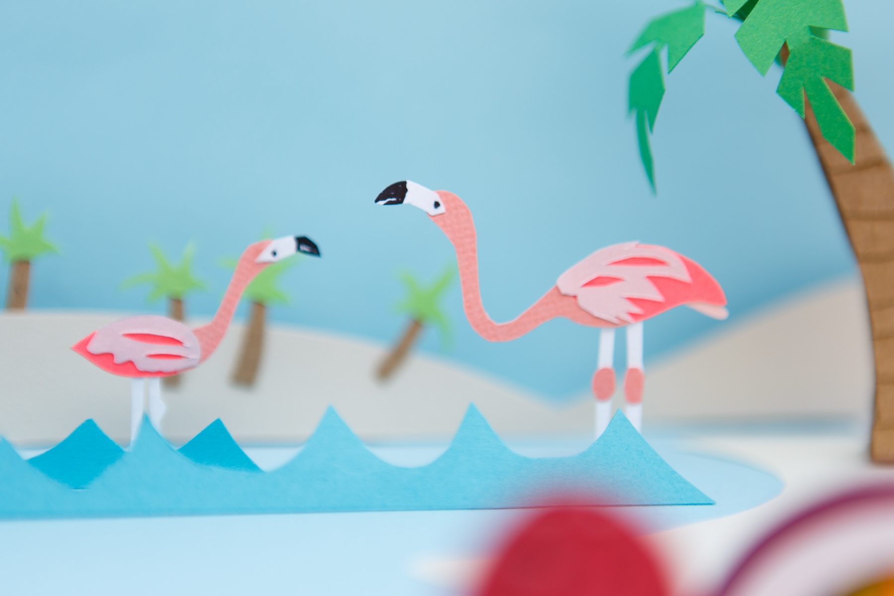
To capture the tactile essence and premium nature of the brand, I brought the labels to life through intricate, multi-layered paper sculpture. Working closely with PDCO’s creative direction, I meticulously translated the unique story of each wine into a three-dimensional paper scene. By balancing rich textures, sharp geometric cuts, The resulting designs were so well-received that one of the labels went on to scoop an award at the prestigious Australian Alternative Varieties Wine Show.